


Our previous design guide blog post talked about core UX/UI best practices in building digital commerce platforms; this article extends this guidance with a deeper dive into the specifics of good design principles in the buyer’s journey from viewing your products online to becoming a customer and completing a purchase – and what should happen afterward that turns a customer into a repeat buyer and advocate for your brand.
Part 2 of our guide below takes you through the key elements you should include in your customers’ buyer journey and how critical the path from product to purchase and beyond the CX journey (like post-purchase product reviews) is to your business’s bottom line.
Product Pages (And Product Category Pages)
Your customer found your website and, following the path of our previous blog post, engaged with your home page, found their way through your navigation, and discovered your products.
Typically, the taxonomy of your products will include one or many categories (these might include segmentation of your products into ‘types’, brands, uses, gender, suppliers, etc.).
However, you shouldn’t assume that visitors get to your product pages via your homepage or product category pages first; there is a good chance that when people find your B2B e-commerce site through search engines or via a social media post, for example, they actually land directly on a product page.
This means that you need clear information on each product page (or any other likely landing page) that defines your brand and business – as well as all the relevant tools, guides, and media that can help to push people to buy your products.
- Use filters carefully and logically. Only use filters that are linked to the products in that category. Use enough to narrow down decision-making, but not so many that it makes filtering and selection a chore, and most importantly, make sure that filters work and that all the products are categorized correctly.
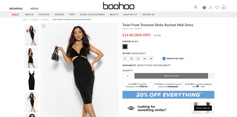
- Optimize the product title so potential customers can easily see it and show the product code or SKU on the product page, especially for B2B customers. Supply as much product information as possible so they know exactly what they’re getting, including photos, detailed specs, sizes, and colors.
- Make sure the actual size of the product is very clear. For example, provide clothing or jewelry sizing charts, or show the product in relation to a recognizably sized object.
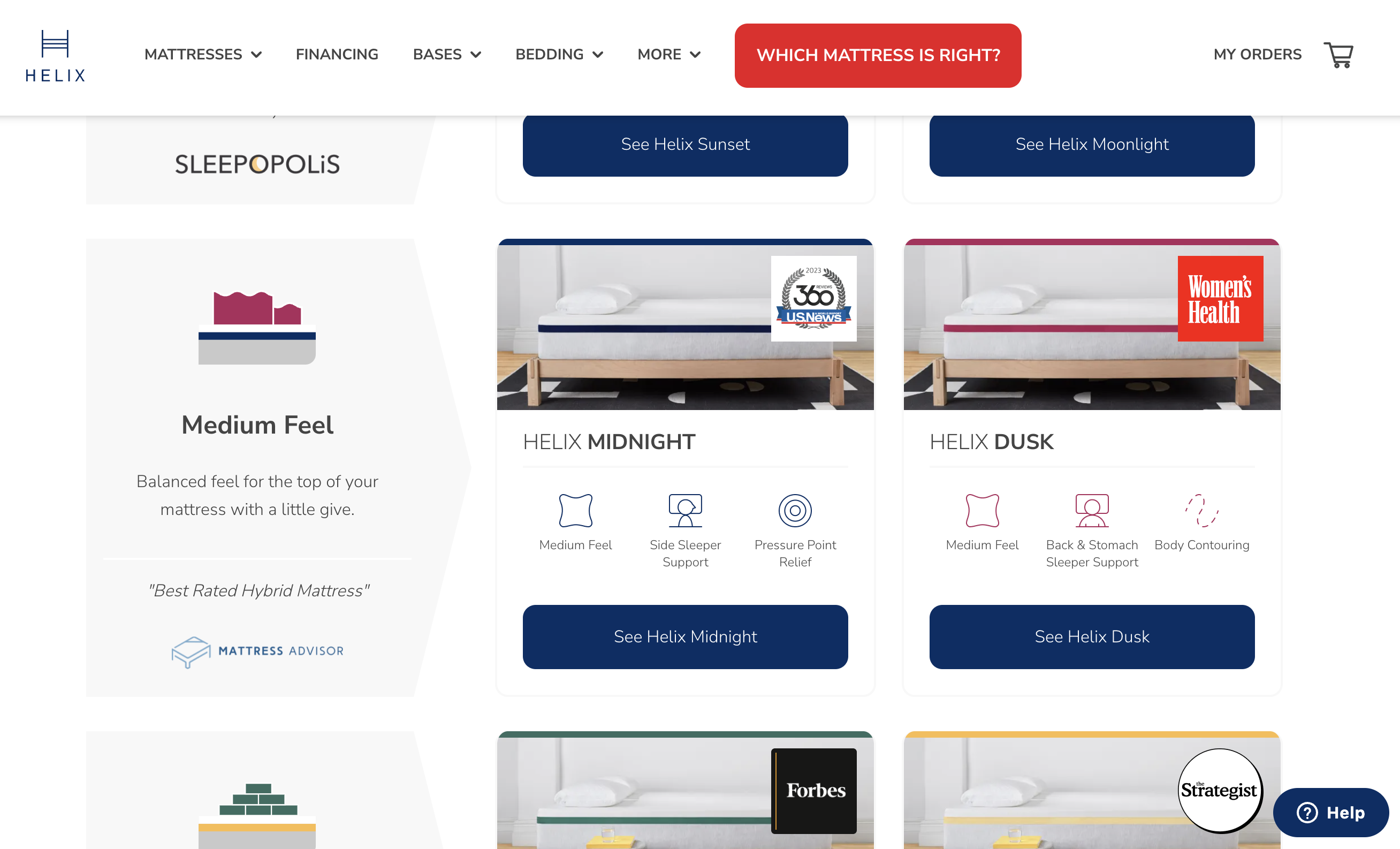
Product Images
- On both category and product pages, use uniform product photos. It is a design factor that creates a clean and calm user experience and drives conversions, making all products readily comparable.
- Display high-quality, optimized images from multiple perspectives and, if possible, with zoom or 3D rotational functionality. Research has demonstrated that customers relate to products most strongly when they can view the product in use (for example, watches sell better online when the product images include a picture of the watch worn by a model)
Pricing & Availability
- Make sure the price is clear. Where discount prices are being offered, find a way to display the original and discount prices and possibly highlight the difference, either in money or percentage terms. Consider making discounted or sales items the focus – either by appearing at the top of any lists or category pages and/or by having an additional sales category and dedicated sales page.
- If your store operates in the B2B sector, for your pricing page design, you will need to decide whether products are visible to visitors who are not already registered and logged into your site; and if you do provide open access to your product catalog, whether you display generic prices (for example by displaying “Prices From $XX”) or no prices. On a B2B e-commerce platform, pricing options may be highly individualized by grouping customers or offering totally personalized pricing per customer.
- If possible, display live inventory levels so buyers can see how many items are available; make it clear if a product is sold out and offer relevant alternatives. Also, decide whether to allow back-ordering or notifications when the product becomes available again.
Clear and Prominent Actions
- Ensure that the Add to Cart button is prominent and offer an Add To Wishlist/Favorites option – customers frequently take several sessions, and possibly on different devices, before they make a purchase – ensure that it is as easy as possible for them to pick up where they left off and can move through product selection to purchase in as few steps as possible.
- Add buttons that make it easy to share the product on social media and on social messaging so that links to product pages can be shared in one click.
- Cross-sell and up-sell by using “other customers who bought this also bought…”, “recommended/related products”, or “accessories you may need when buying this product” – and personalize this as far as possible – around 35% of Amazon’s revenue comes from cross-selling and up-selling.
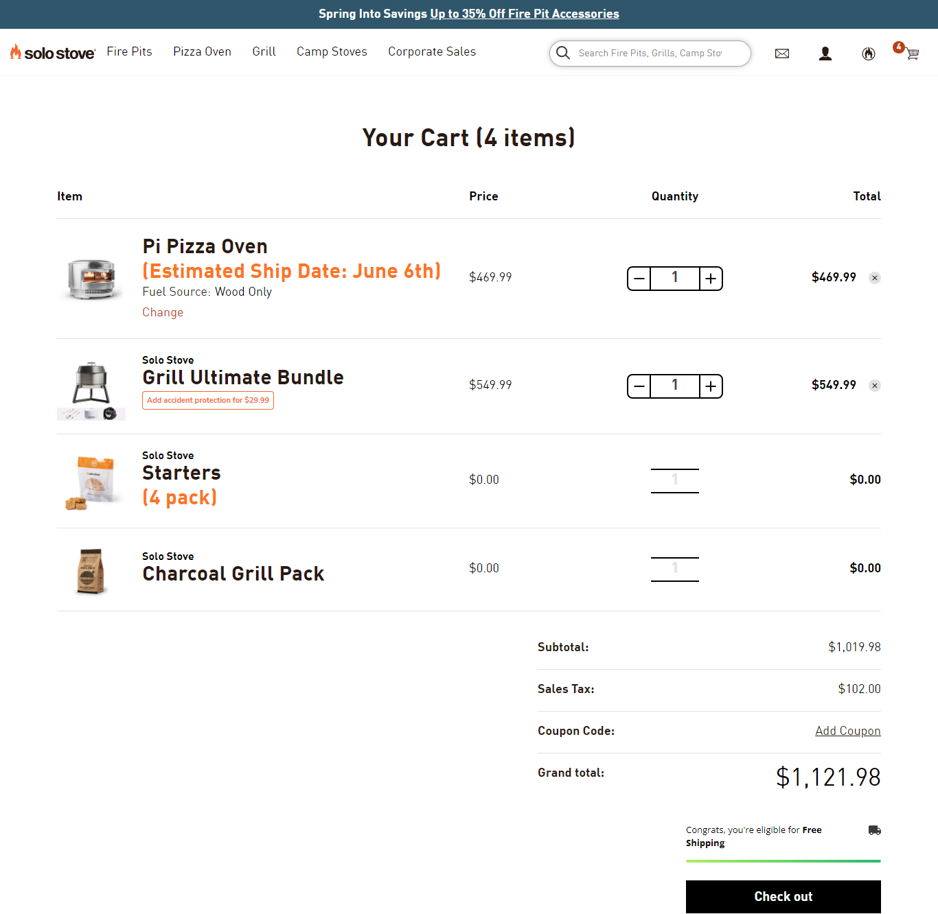
The Shopping Cart
Your customer is poised to buy; now is the time to minimize distractions and help them focus on the product and the final purchase process. The online shopping cart design is critical to the purchase process – ensure it works for you and your customers.
One of the most significant metrics for e-commerce is “abandoned carts” – do everything you can to ensure this doesn’t happen – the global average shopping cart abandonment rate is 75%.
- Make the shopping cart, the number of items in the cart, and the order total visible in the header so the visitor can see it wherever they are on the site.
- Display the checkout button prominently on the Order or Cart page.
- Ensure customers can easily change the number and size of products in their cart and make it easy for customers to delete items in their buying cart or, even better, save products for later.
- Ideally, keep products in a cart for 30 days, as customers sometimes browse and return later to complete their purchase. Inform the customer when their cart order will be cleared to avoid disappointment and send emails regularly to customers with unfinished orders to prompt them to complete their orders. Consider offering discounts or other promotions to customers to nudge them into completing their orders.
- Allow users to access their online cart anywhere, anytime, even from another device, by associating it with their account and avoid using sessions to persist this data, as it can be lost across browser sessions or devices.
- Make shipping costs and timeframes clear throughout the checkout process and offer more than one option (collect from store or a collection point) – another significant cause of abandoned carts is customers unhappy with “hidden” charges.
- If you offer free shipping over a certain spending threshold, remind customers of this to tempt them to add more to their cart.
- Make several payment options available, with reputable badges, so customers can choose which one they’re most comfortable with
The Checkout process
Your customer went from filling their shopping cart and is now in the queue at the checkout. This is the last step and the last point for things to go wrong – ensure your checkout process works. At this point, on many sites, barriers appear; users must register (why?) or provide a lot of detail to purchase. When you go to the supermarket, does the checkout operator ask for all your personal details? What would you do if they did?
- Unless you are operating a B2B platform where customers must be registered first, always allow customers to order as guests – then integrate their registration into the checkout form, providing an easy option to opt-in or out. Do not force customers to create an account before they place their order. There is no business reason on this earth why they should need to do this.
- Try to capture customer email addresses as early as possible in the buying process, so you can follow up with customers should they abandon their cart.
- Make checkout as quick and easy as possible, preferably on one page – multi-page forms are a significant barrier and another primary cause of shopping cart abandonment.
- Consider saving as much information as possible for repeat customers so they don’t have to fill in their personal and delivery details every time. Ask your payment gateway about saving and displaying previous credit card details too.
- If you provide promo codes, offer a space to type in promotional codes, but display this out of the way so it’s not distracting.
- Invite customers to continue shopping after they’ve checked out.
- Include explanations and advice on filling in fields that may be technical or not common knowledge, for example, the CVV field.
- During checkout, the header and footer (and everything else from the main website) should be removed from view so customers aren’t distracted from the checkout process or accidentally click away.
Customer Experience journey beyond Purchase
We all know that it takes time to convert a visitor into a customer and then a loyal customer, so do everything you can to save money and automate the process of bringing them back to your site. Invest in email marketing automation software and retargeting advertising to do this for you.
- Send a post-purchase receipt immediately after purchase with details of what they bought, delivery information, useful product information, an option to cancel, and an invitation to join your loyalty club or sign up for notifications of new products.
- Provide regular updates about the order, including delivery tracking and information via email, SMS, or Social Messaging until the package (if there is one) is in the customer’s hands.
- Refrain from asking for a survey response immediately after checkout; save this for a later follow-up email – nobody will respond at this point. If you operate a platform that allows for customer reviews, send an invitation to review the product a few weeks after the product has been delivered.
- If you sell products that are complex enough to warrant it (for example, electronic equipment), follow up with useful information about the product they bought post-purchase.
- Send occasional and relevant promotions that you know they would be interested in, offer discount codes to past customers if they haven’t ordered again after a few months, and incentivize reviews in exchange for specials and discounts as part of your loyalty program.