


Our last thought leadership article discussed the challenges around, and some of the solutions for, delivering superlative Customer Experiences in the B2B digital commerce sector.
When working on B2B e-commerce platforms in the enterprise space, it’s often easy to get lost in engineering and the effort to launch a high-performance, high-availability platform for large-scale commerce activity and to focus on the back-end systems integration and wiring complexity – and by doing so, let the front-end storefront play a secondary role.
But great digital CX also requires that the front-end User Interface provides a platform that users want to interact with, enables them to purchase your products with the least effort, showcases other products they might be interested in buying, and encourages them to come back again the next time.
The following is Part 1 of a 2-part guide to the best practices for UI/UX design that any digital commerce site should adopt. In this part, we will look at a store’s core elements, from overall design thinking to essential user interface design elements such as Navigation, Forms, and Content.
Overall design and architecture
How your website is designed and laid out make a huge difference in customer experience. Design trumps functionality by a huge margin – this fact has driven the entire marketing industry for over 100 years. The design should fit your audience and channel your customers to where you want them to go. The following must be emphasized when designing customer experiences:
- Build trust by displaying a security badge, shipping and returns policies, and secure payment options.
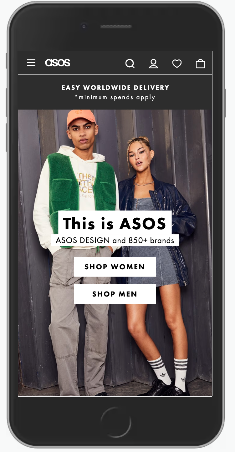
- Avoid unnecessary animations, carousels, and flashy graphics – it’s considered bad practice and distracting.
- Give your customers multiple ways to contact you and make it visible everywhere on your site, provide live chat so customers can ask questions in real-time and display links to your social pages on every page.
- Do everything you can to speed up page loading time – this is a search ranking factor and influences user experience and conversion rates.
- Display a shopping cart at the top in case customers have saved items from a previous visit, and show the checkout button clearly on every page.
Secure and safe shopping
If customers don’t feel safe on your digital commerce platform, they won’t buy from you – if your site isn’t secure, someone will try to rob you (or, more realistically, your customers)
- Ensure your B2B digital commerce website is secure and that your SSL certificate applies to your entire site, not just checkout pages. Ensure your SSL certificate never expires (diarise the expiry date).
- Conduct a PCI check and complete your PCI Self-Assessment as a minimum. The potential fines for failing a PCI check after a fraud incident will almost certainly bankrupt your business if the reputational damage doesn’t.
Mobile-first design
Mobile devices now account for 50-60% of global traffic; you should always ensure your store or B2B ordering platform works fully on a mobile device; if you don’t, you may lose half of your potential visitors and half your potential revenue.
- Build in time during the design phase of your project to ensure your digital commerce platform works on at least 2 mobile breakpoints (tablet and mobile)
- Investigate where your traffic is coming from and make sure your store works across Android and iOS devices, both with current versions and devices that are 3 or 4 versions older.
Optimizing your content
Consider the messages you want to relay – treat content as a conversation, not a one-way street; keep any text short and sweet. The modern website user experience design preferences reduce text content and make more use of images and media.
- Include useful and informative information such as product reviews, testimonials, tutorials, helpful internal or external resources, radio or podcast interviews, articles, and/or recent news about your brand or industry
- Create a personal connection with visitors with an “About Us” page and photos of your team. Make your visitors feel at home and increase conversions by personalizing your website as much as possible
Creating a sticky home page
Carefully manage what your customers see first when they land on your website – the “above the fold” section of your home or landing page is the most precious real estate of your storefront. Give visitors a reason to stay. A poorly designed home page is the no.1 cause of high bounce rates; a boring home page equals visitors who leave and go elsewhere.
- Make this a clear summary of who you are and what you do – and this value proposition should flow throughout the store.
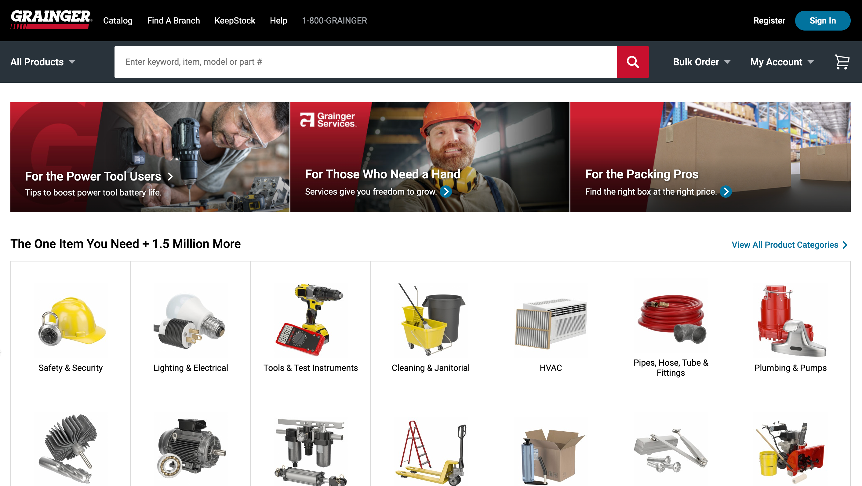
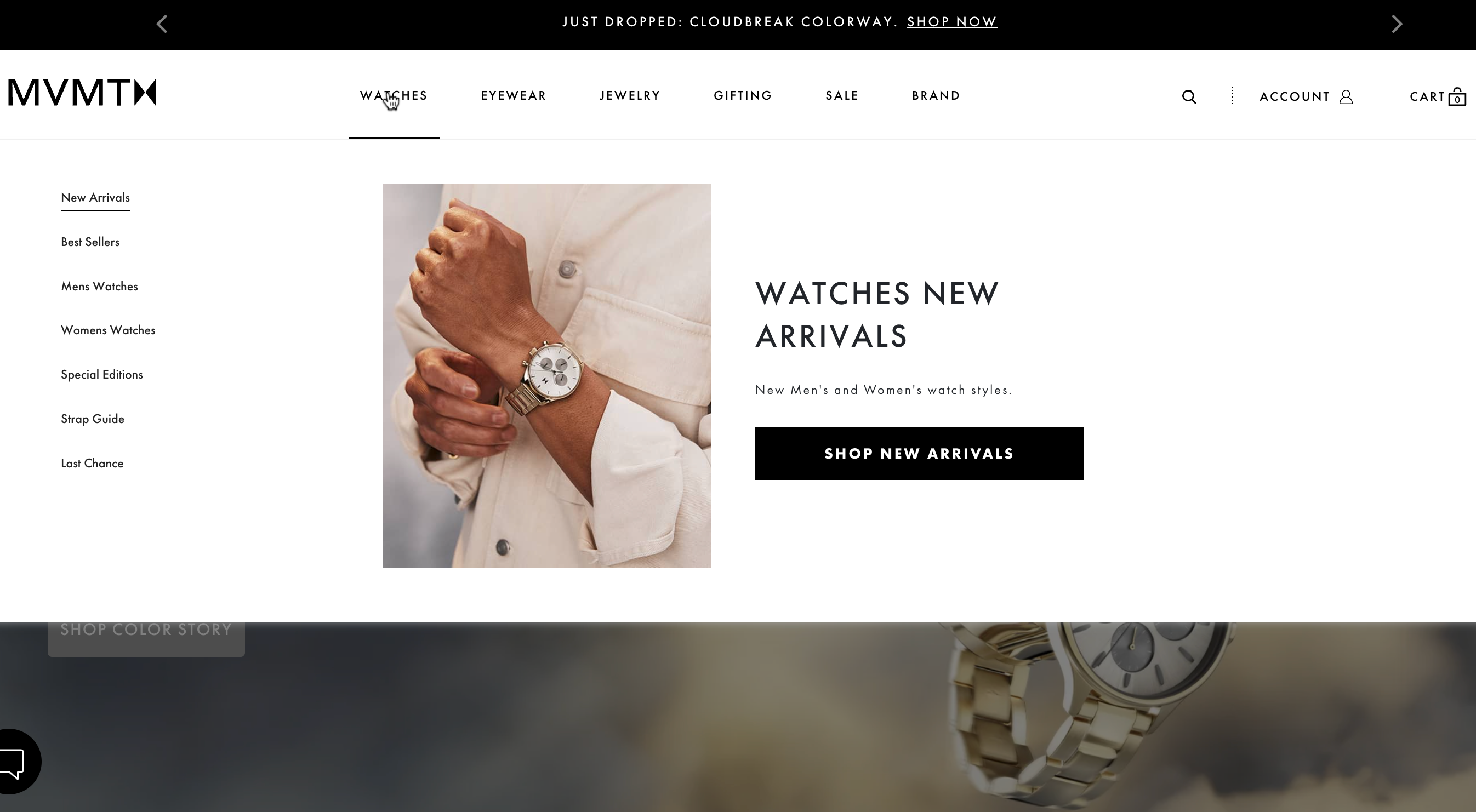
- Design your homepage as a gateway into all the major sections of your website, answering the needs of all your customer segments. Your home page MUST have links to your most popular products (use analytics to inform this)
- Avoid carousels unless you really need them – they take up space, slow down your site, and are considered outdated today.
- Use clear CTAs (Calls to Action) to push people to important pages, products, and content.
Clear and logical navigation
Nobody will buy your products if they cannot find them. Don’t fall into the trap of thinking that the way your products are ordered in your ERP system or back-office spreadsheets is also obvious to your customers – they may not think like you. Start by thinking about how you would find things if you didn’t know exactly what you were looking for. Bad navigation is probably the most common error in online commerce – and it can potentially lose you a lot of revenue if you get it wrong.
- Ensure your navigation menu is simple and uses familiar terms – organize products in a way that makes sense. Taxonomy is an art and a science – spending time on it is worth it.
- If you have many products, include filters on category and product pages to help customers find what they want. Chose the type of menu carefully to fit your content (Megamenu, Vertical, Horizontal, Fixed/Sticky, Fat Footer, etc.)
- Make sure the menu is responsive, but don’t use hamburger menus on the desktop view – it’s an annoying gimmick and hides your content from visitors.
Minimal use of forms
Everyone hates filling in forms. Don’t make filling in forms a barrier to visitors becoming customers; always think about ‘why’ you want your customers to fill in a form. You want your customers to fill in forms because you want information from them – they fill in the forms because they want to get something from you. Forms are perceived to be friction for most visitors and cause bouncing, so limit the use of forms to only when absolutely necessary – and then make them as short as possible. Auto-fill forms wherever possible, especially for repeat customers
- Don’t ask for things you don’t need (aside from anything else, you could be complicating your own GDPR compliance by asking for too much information). Are you really going to call the customer on his phone? If not, then don’t ask for his mobile phone number. Do you really need to know if your customer is a “Mr”, “Mrs”, or “Ms”?
- Design forms so they are easy to fill in. Avoid drop-down lists; they are UX/UI hell, especially on a mobile device. Don’t force users to enter data in a particular format unless you have a 100% business reason to do so – most humans know their post code, and they don’t need you to tell them how to format it.
- Consider responsive designs – when someone submits an order or form, they should be taken to a thank you page and receive an auto-response email, with the ability to report a data breach if it was not them that provided the data.